
It was the fall of 2021. A new team had just formed, and the backend infrastructure serving the entire company was already live. Over 180 companies had been migrated, and 17,500 employees each had their own digital workspace.
That's when I joined. My job was to give all that data a voice and an aesthetic. At the time, HR teams were buried in complex onboarding workflows, and employees struggled to understand their own status and processes. The system worked, but the experience lacked clarity and direction.
As lead designer, my task was to define why this app should exist. How could it reduce complexity for HR, give employees more control, and turn a dense backend into something intuitive? From there, it was about partnering with engineering to bring it to life.
I'm proud of how we handled the complexity. What started as an internal tool evolved into a standalone product that went to market.
With 2.2 million customers across 28 countries, Visma is focused on future-proofing businesses at scale.
Through research and questionnaires, we identified several areas that were unnecessarily complex to manage online. These were workflows that needed clarity, structure, and a bit of thoughtful attention.
Together with the tech team, I helped design a new experience that made navigating, managing, and planning corporate tasks simpler and more visual. The goal was to translate operational complexity into an interface that felt structured, intuitive, and scalable across markets.
The Problem
VOM already held the data. Over 180 companies and 17,500 employees, each with their own digital workspace. But all that structure was buried in backend complexity, and for the people using it every day, the experience was harder than it needed to be.
Existing tools focused on structure.
Not on people.
Opportunity
That question reframed the brief. The job wasn't to expose a database; it was to turn an org of thousands into something an employee could feel part of from day one.
Understanding Employees
When I join a company, I want to quickly understand who people are so I can feel connected sooner.
When I need information about a colleague, I want to find it immediately without navigating multiple tools.
When important moments happen, I want to celebrate them effortlessly.
Principles
Faces matter more than org charts.
Small moments build culture.
Users spend seconds, not minutes.
Mobile and desktop should feel like one ecosystem.
User Flows
Discovering a colleague
Welcoming newcomers
Celebrating birthdays
Exploration
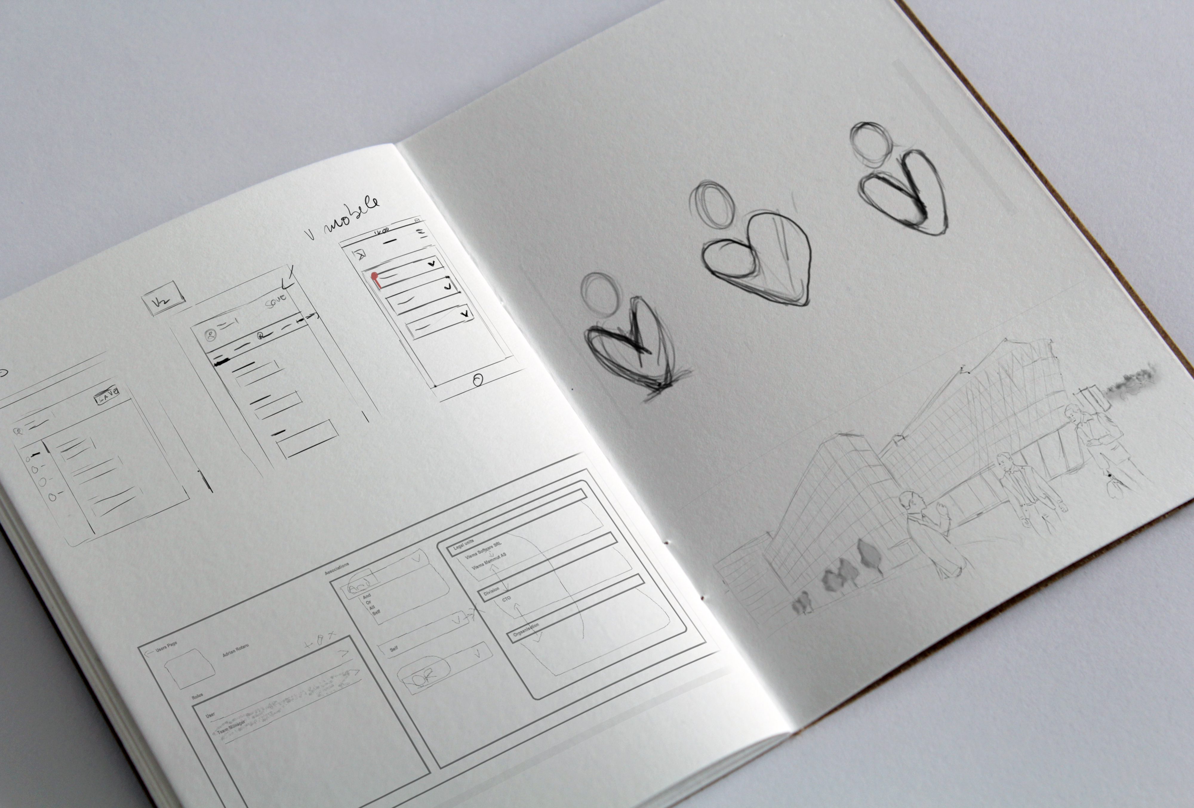
Before the visual layer, we pressure-tested the fundamentals. Card versus list layouts, how prominent search should be, where information sits in the hierarchy, and how mobile-first the interactions needed to feel.
The Home Experience
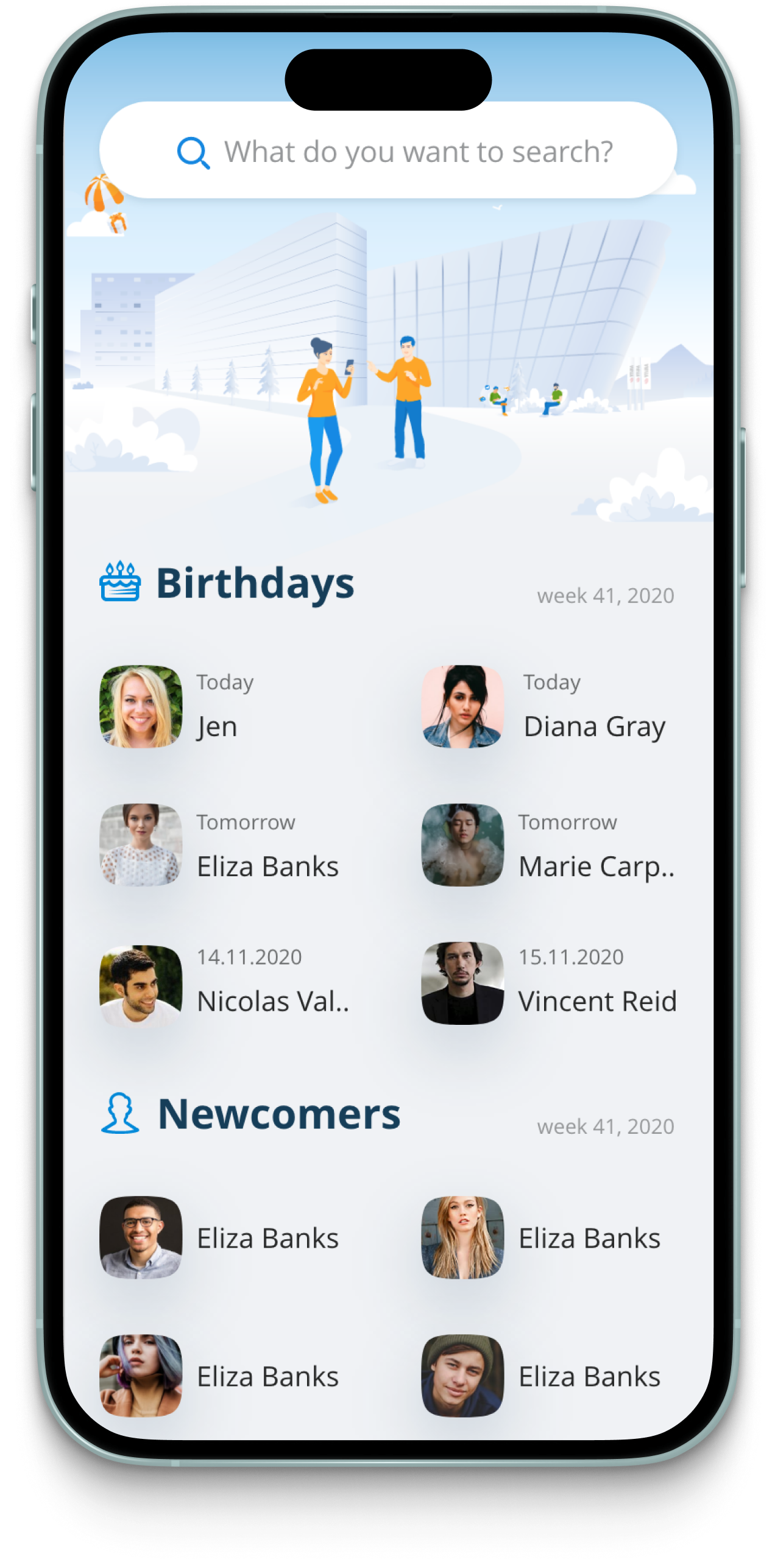
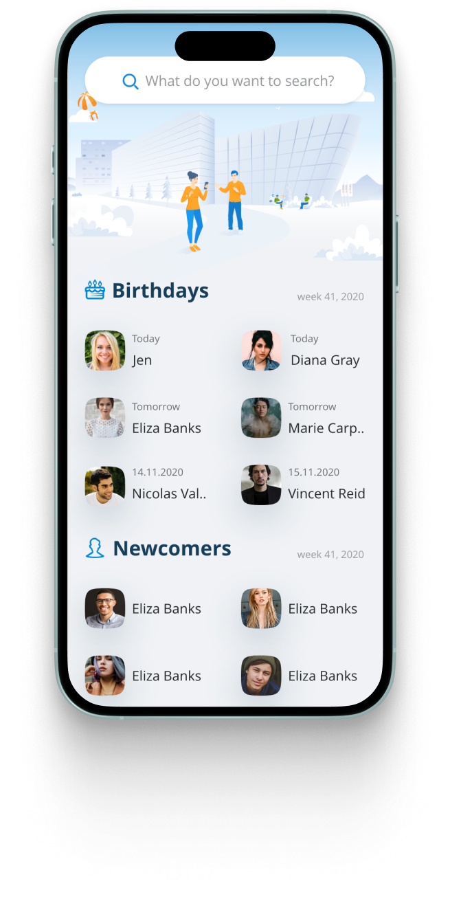
So the home screen had to answer three questions instantly. Who joined recently? Who's celebrating today? What actually matters right now? Rather than overwhelming people with everything at once, we focused on the moments that bring them back.
Rich Profiles
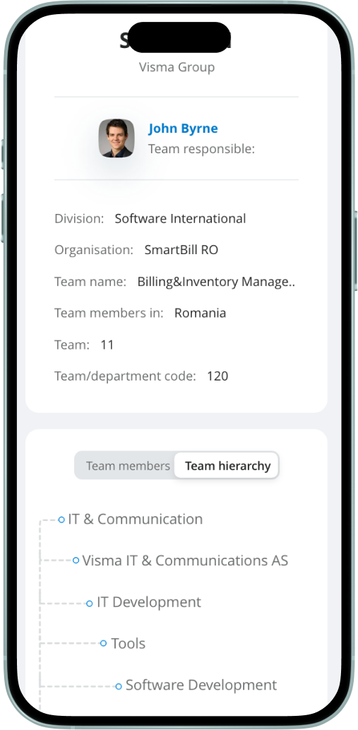
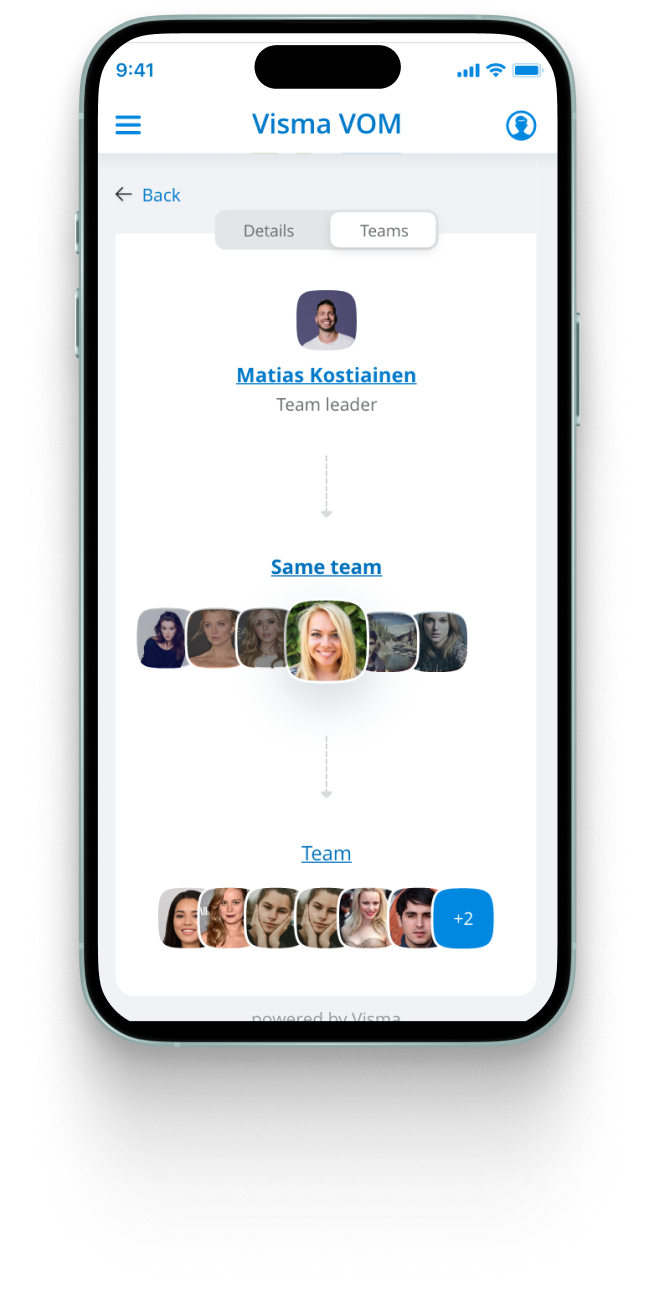
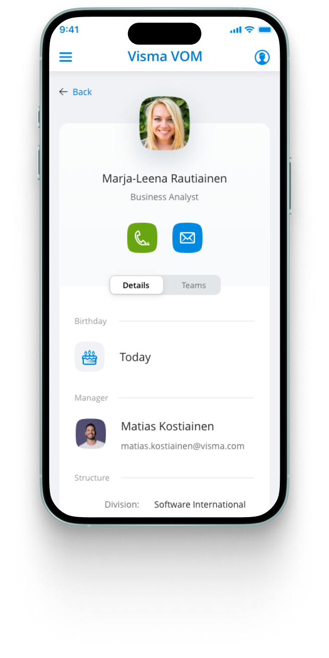
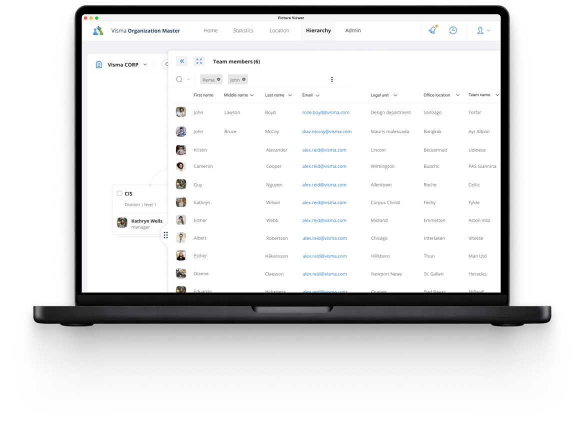
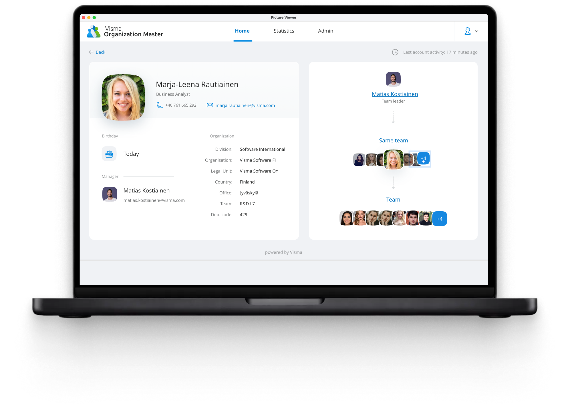
They help employees understand roles, teams, relationships, and the connections they share, so a name turns into a person you can actually place in the organization.
Managing the Organization
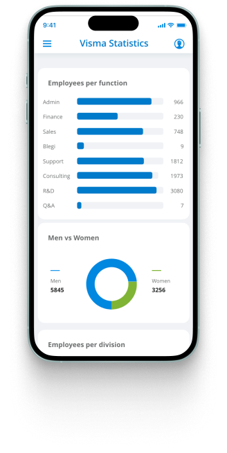
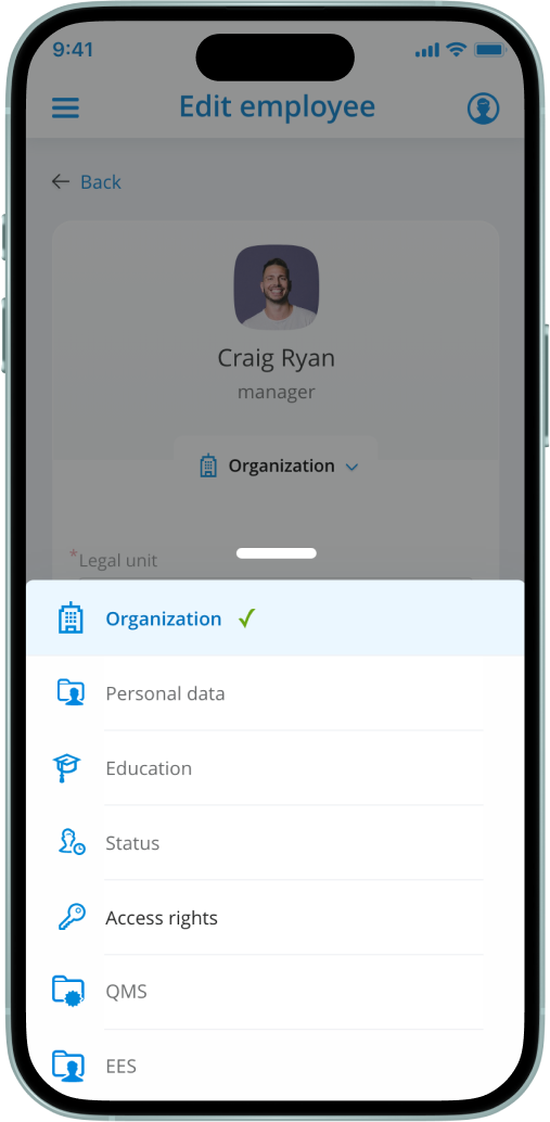
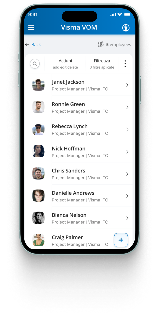
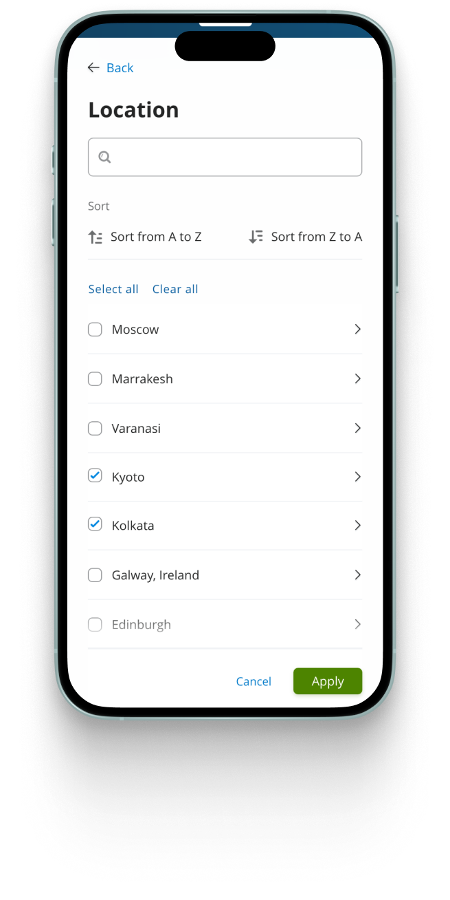
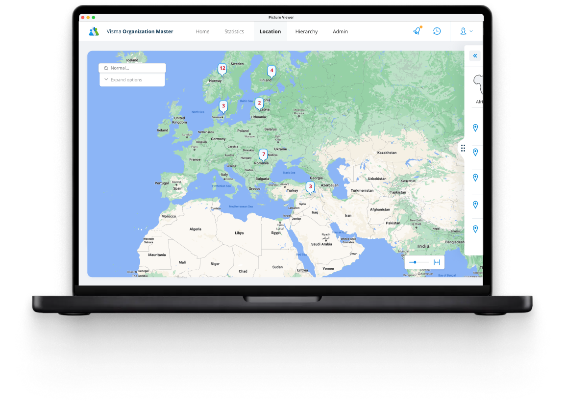
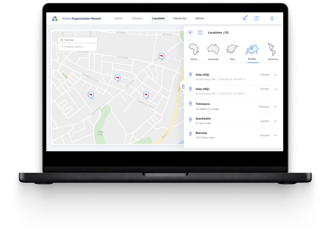
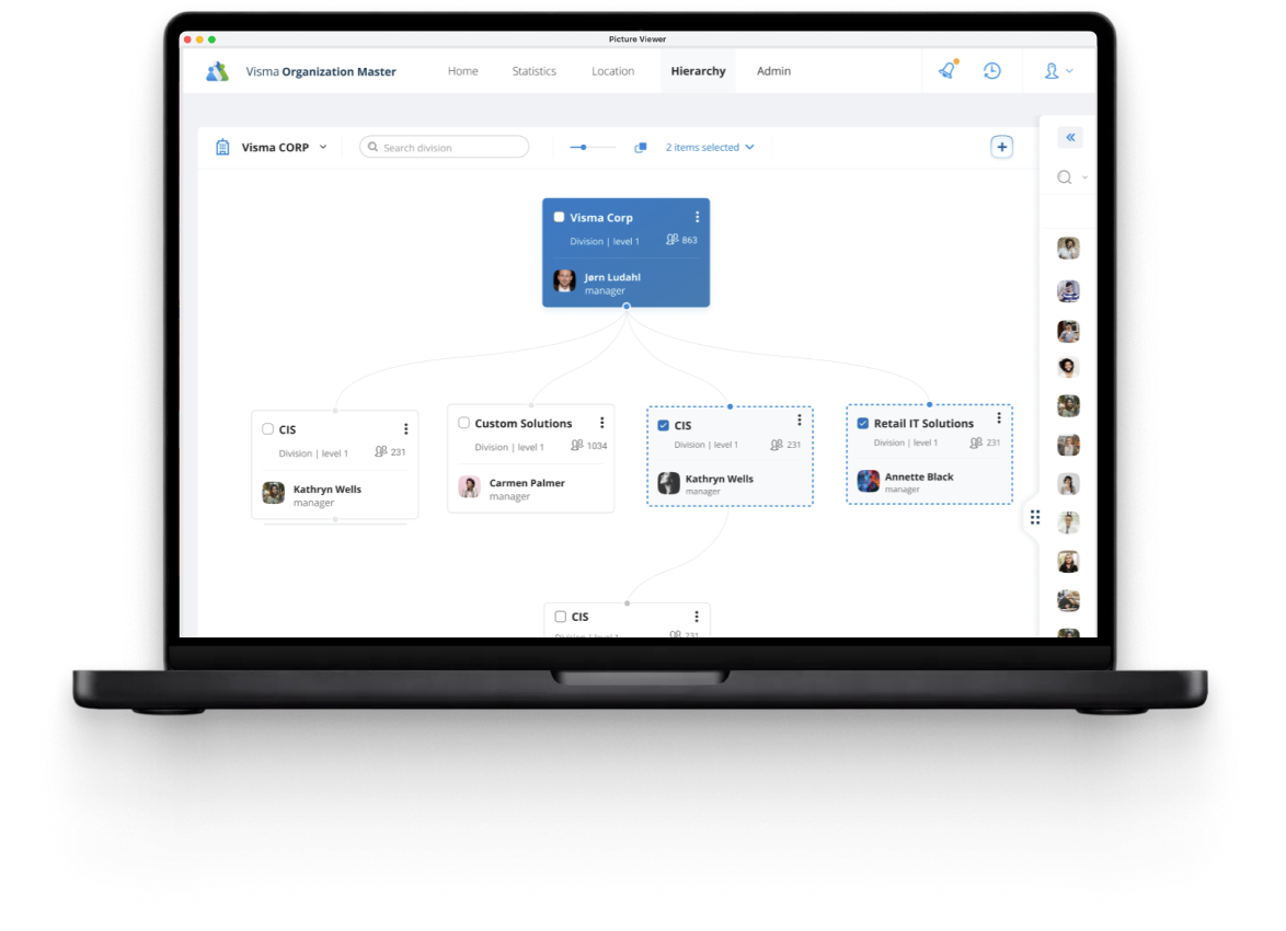
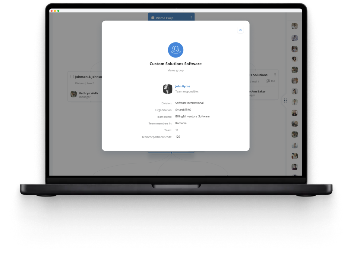
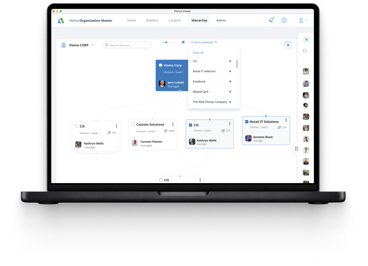
Behind the people layer sits the org master: locations, offices, corporate and employee structures. Admins get powerful filters and editing tools, presented so the dense backend never leaks into the experience.
Cross-platform
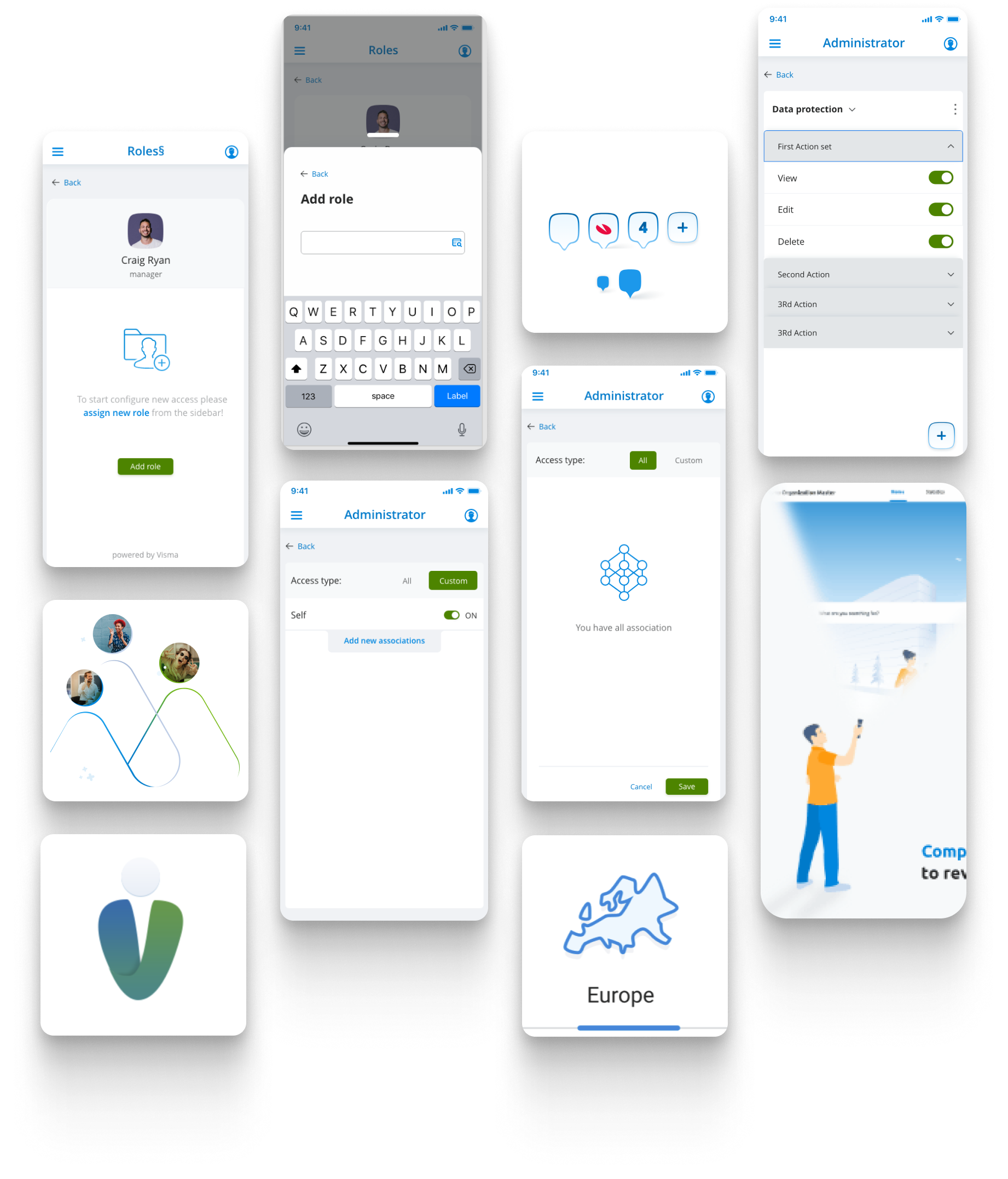
The experience had to feel native on every device, staying consistent while playing to each platform's strengths.
Design System
A shared component library let us stay consistent, move faster, and add new modules without reinventing the basics every time: colors, typography, components, states, and icons.
Key Decisions
People remember people, not organizational structures.
Instead of showing everything, we leaned on progressive disclosure.
Birthdays and newcomers create real reasons to return regularly.
Outcome
Reflection
Designing VOM taught me that workplace products aren't just productivity tools. They're social systems. The hard part was never really helping users finish tasks. It was helping people feel connected.