A few months ago, after long negotiations with the leadership group, we made a decision: build a new face and a new experience for the main product — from scratch, with almost no constraints. No compromises for legacy code. No shortcuts because of infrastructure debt. Me and the development team knew the product well — its friction points, its red flags — but we wanted something fresh. While Christian, the lead developer, analysed what the platform could technically support, I had one job: start from the user and work forward.
I started with structured user interviews and feedback sessions. What came back was rich and messy — overlapping needs, contradicting mental models, and a long list of frustrations buried in workarounds.
That's where AI entered the process — not as a shortcut, but as a thinking partner. I used it to translate and group feedback across formats and languages, audit my UX pillars against the real data, and co-build personas grounded in behaviour patterns rather than assumption.
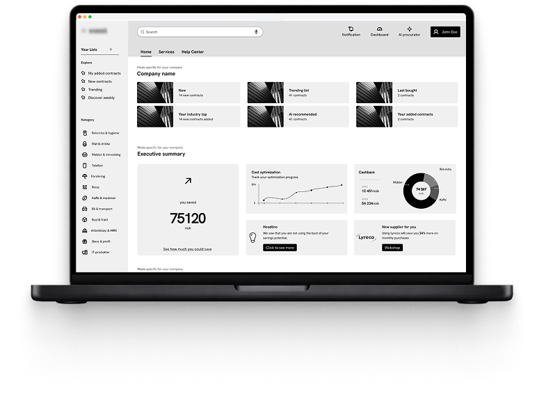
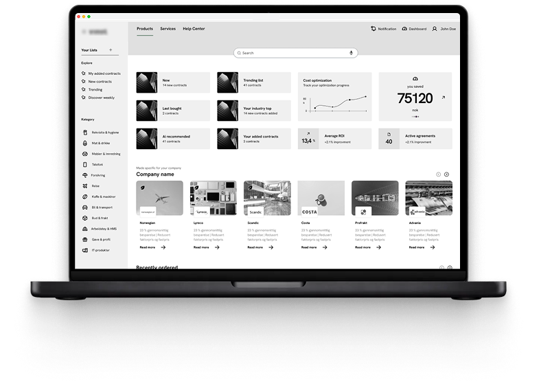
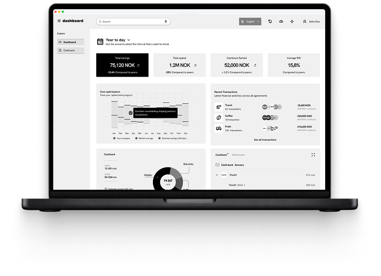
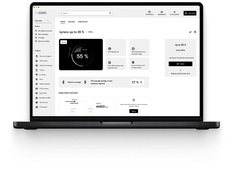
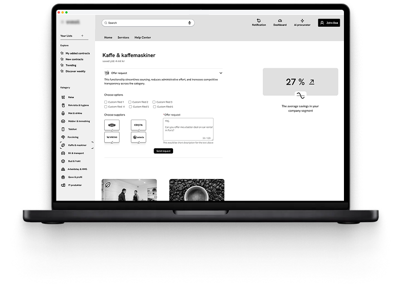
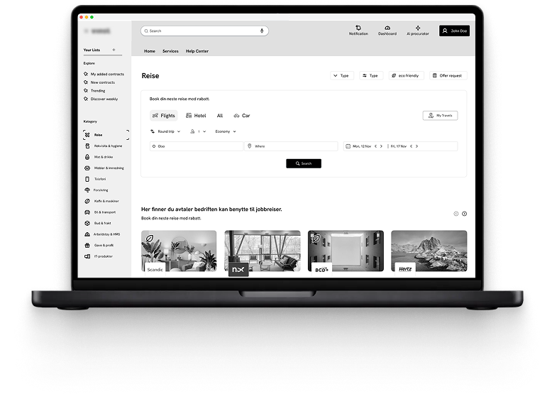
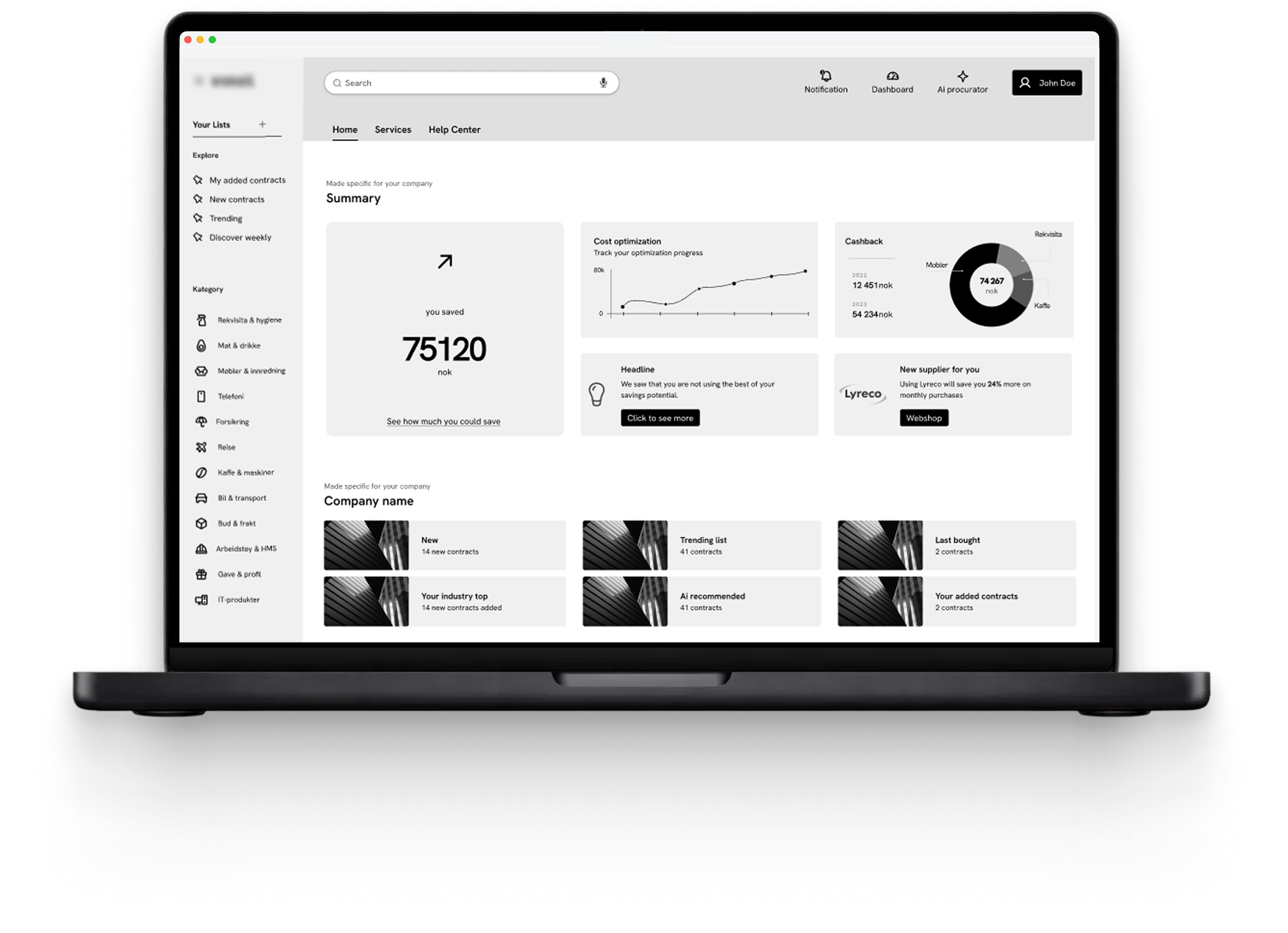
When it came to wireframes, everything was kept deliberately grey. Stakeholder reviews need to stay focused on flows, content, and journeys — not colour. It's the fastest way to get the right feedback at the right time, and avoid the "I don't like this blue" conversation.
Fieldwork is a platform built for professionals navigating complex, multi-step workflows every day — people who need tools that reduce friction, not add to it.
The research phase surfaced four recurring pain points: unclear status tracking, steep onboarding for new team members, missing mobile-optimised flows, and structures that prioritised data storage over actual decision-making.
By the time wireframes began, every element on screen had a reason — traced back to interviews, shaped by pillars, validated by AI, and agreed on with the team. That's what a grounded design process looks like.
Research & discovery phase
My role
End-to-end ownership — from running interviews and synthesising research to defining the product direction, facilitating stakeholder reviews, and delivering validated wireframes ready for development handoff.
UX Pillars
Every screen should answer one question at a time. No information overload, no hidden complexity.
Users need to know where they are, what changed, and what to do next — at every step of the journey.
Experienced users shouldn't be slowed down by onboarding flows designed for newcomers.
Most fieldwork happens on the go. The product had to follow the user, not the other way around.
Wireframes
Greyscale wireframes focus stakeholder reviews on what actually matters — flows, content hierarchy, and user journeys. No colour means no distraction. It's how you get the right feedback at the right stage, and keep conversations on the work that moves the product forward.
Stakeholder review
The first review gave us a clear direction: the dashboard needed to lead with business numbers and savings, spend, contract performance, and less marketing content. Cross-selling and upselling modules had value, but they needed their own space. Mixing them into the core flow was creating noise where users needed signal. We restructured the IA around that distinction and went back to the board.