Design System · Figma → Storybook → Production

A design system
that builds itself

Three brands, designers in Figma, engineers in code — and the two drifting apart. I built the connective tissue between them.

Tokens live in Figma and sync to GitHub. A build step turns them into code. Components live in Storybook and ship through a registry that deploys on Vercel — change a color in Figma and it reaches production with nobody re-typing a hex. I'm a product designer, and I built the whole pipeline myself, with AI as my engineering partner.

Figma Token Studio GitHub Style Dictionary Tailwind v4 Storybook Vercel
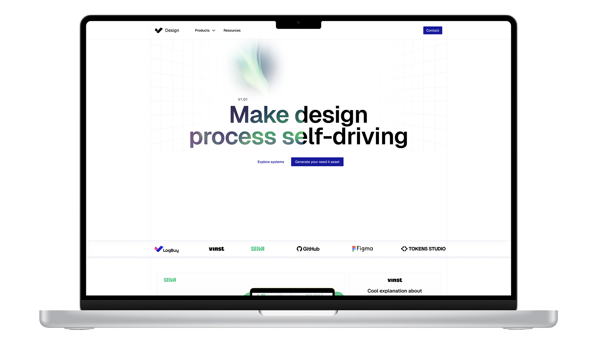
The Advantage Design System landing page — “Make design process self-driving” — with LogBuy, Vinst, Seiva, GitHub, Figma and Tokens Studio
The system's own front door — built on the same tokens and components

A design system isn't a folder of components. It's the shortest path between a decision and the thing that ships — and I wanted that path to run on its own.
Visma is one of Europe's largest software groups — millions of customers across dozens of markets. Inside it, Advantage is one of three sibling design systems I help shape, each its own brand with its own scope. They can't share a codebase, but they all have the same job: make the right design decision the easiest one to ship.

Advantage is where I pushed that idea the furthest. The brief I set myself was simple to say and hard to do: one source of truth in Figma, flowing into code on its own, with the brand built into every step instead of left to good intentions.

Role
Senior Product Designer
Timeline
2025–2026
Built by
One product designer, with AI as engineering partner
Stack
Figma · Style Dictionary · Tailwind v4 · shadcn · Storybook · GitHub · Vercel

The Problem

Design systems don't fail at the component. They fail at the handoff.

Every team has the same Figma library and the same good intentions. The drift creeps in between the tools, in the gaps nobody owns:

  • Tokens get duplicated. A hex in Figma, a different hex in CSS, and no one's sure which is canonical.
  • Components get re-built per project. Each team hand-rolls its own button, slightly off, forever.
  • Deploys are manual and fragile. A token change means someone remembering to rebuild, re-export, and re-publish — so it often doesn't.
  • AI assistants invent UI. Ask a coding agent for a button and it makes up a plausible, off-brand one from its training data.

The gap was never the components.
It was the pipeline between decision and default.

Opportunity

How do I make a change in Figma show up in production — without anyone copying values by hand?

That question reframed the whole thing. I wasn't shipping a UI kit; I was designing the shortest distance between a design decision and the code that honors it — and making the automated path the easy one, so the right thing happened by default.

The Operating Model

One pipeline, end to end

A single decision in Figma travels through six automated stages and arrives as installable, themed, accessible code. Nothing is hand-copied between stages — each one is generated from the one before it.

Source Figma · Token Studio Colors, type, radius & shadows edited as variables, synced to Git.
Truth tokens.json The single source of truth — W3C design-token spec, versioned in the repo.
Build Style Dictionary Transforms + a sanitize pass turn tokens into clean CSS variables.
Theme variables.css → @theme Semantic tokens bridged into Tailwind v4 so utilities stay in sync.
Distribute shadcn registry 49 themed components, installed by CLI — consumers own the code.
Consume Humans + AI agents Storybook for people; AGENTS.md + MCP so agents build on-system.
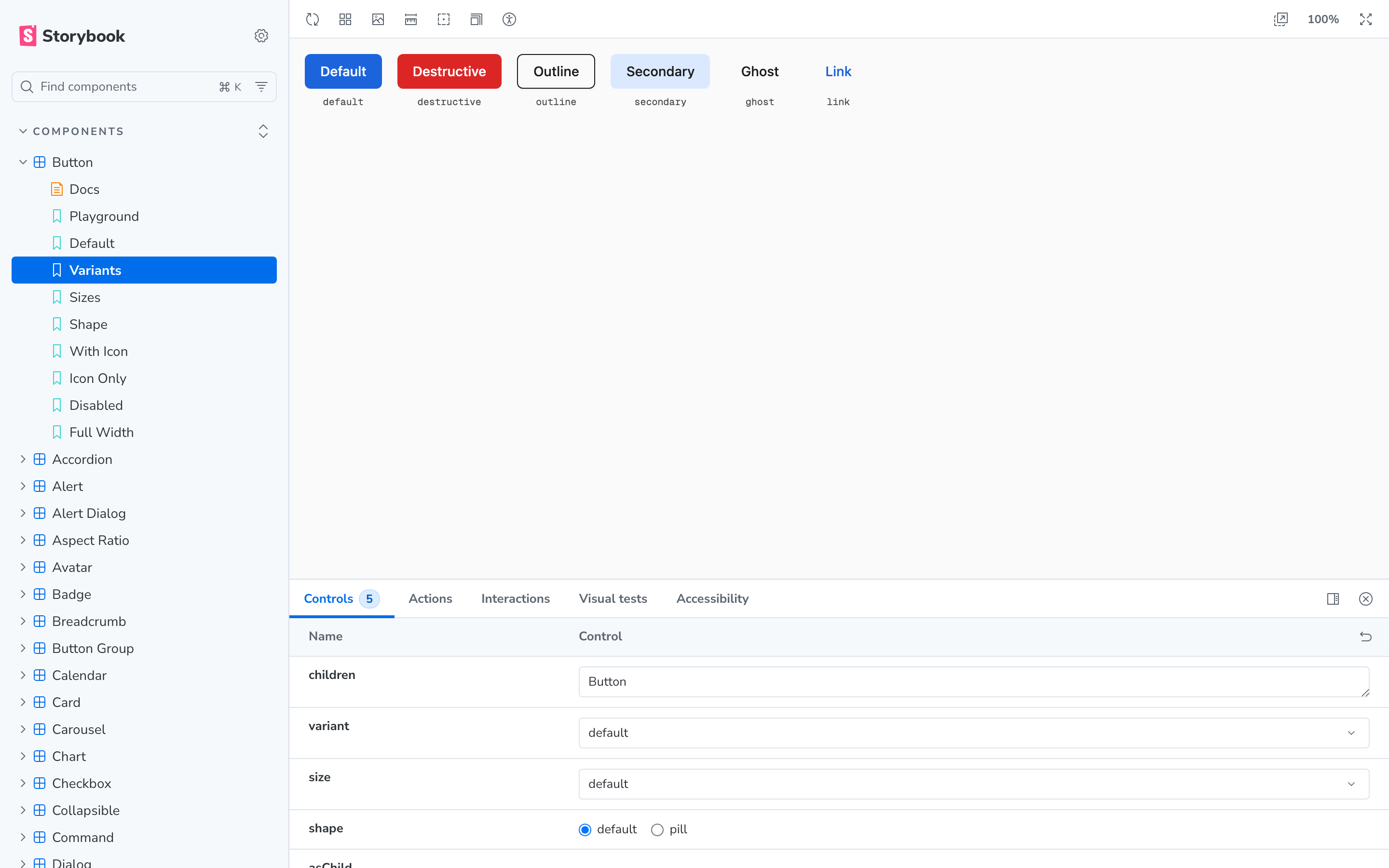
The Advantage Storybook — component sidebar, Button variants in Vivid Blue, and the live controls panel
The living system — Storybook, with every component, its states, and live controls

Layer 01 · Tokens

Figma is the source of truth — not a mirror of it

Every value originates in Figma Token Studio and is exported to tokens.json. No one edits color in code. The key decision here was separating raw palette from semantic intent: components never reference --brand-primary directly — they reference --general-primary. Swap the brand, the components don't move.

--general-primary#1B64DC · Vivid Blue
--general-secondary#DBE9FF
--general-accent#FF9B3D · highlights only
--general-destructive#DC2626
--general-background#FAFAFA
--general-foreground#0F0F0F · all text
--general-muted-foreground#707070
--general-border#BDD7FF
Semantic color tokens — generated from Token Studio, used in every component
Figma export — drop in later Token Studio variables panel Replace this slot with a screenshot of the Advantage variables in Figma — save it to img/ads/figma-tokens.png and swap the image in.
config.js — Style Dictionary
// Token Studio JSON → kebab-case CSS variables
export default {
  tokens: merged,
  preprocessors: ['tokens-studio'],
  platforms: {
    css: {
      transformGroup: 'tokens-studio',
      transforms: ['name/kebab'],     // --general-primary
      buildPath: 'build/css/',
      files: [{ destination: 'variables.css', format: 'css/variables' }],
    },
  },
};

Layer 02 · The Bridge

One file keeps Tailwind honest

Rather than hard-coding values into a Tailwind config (which would instantly drift from Figma), a single @theme block aliases Tailwind's utility names onto the semantic tokens. Developers write familiar classes like bg-primary; under the hood every one resolves to a Token Studio value. Change the token, every utility updates.

index.css — the Tailwind v4 bridge
@import "tailwindcss";
@import "../../../build/css/variables.css";   /* semantic tokens */

@theme {
  --color-primary:      var(--general-primary);          /* Vivid Blue */
  --color-accent:       var(--general-accent);           /* orange — highlights */
  --color-ring:         var(--general-primary);          /* focus = primary */
  --font-sans:          var(--font-family-headings);
  --radius-2xl:         calc(var(--rounded-2xl) * 1px);   /* 25px card standard */
}

Layer 03 · Distribution

Components ship as a registry, not a package

This was the most consequential call. Instead of publishing a versioned React library that every app imports and fights with, Advantage ships its components as a shadcn registry. Consumers run one command and the source lands in their repo — theirs to read, theirs to extend — with the design tokens travelling along as a dependency so the theme is never optional.

49themed components in the registry
~150design tokens from one Figma source
1command to install, themed & accessible
3sibling brands, one operating model
consumer project — terminal
# pulls the real, themed source into your repo — tokens come with it
npx shadcn@latest add @advantage/button @advantage/input @advantage/dialog
buttoninputdialogcardselecttabletabstooltipbadgecheckboxcalendarcommanddrawerpopoversheetsidebarchartsonner+ 33 more
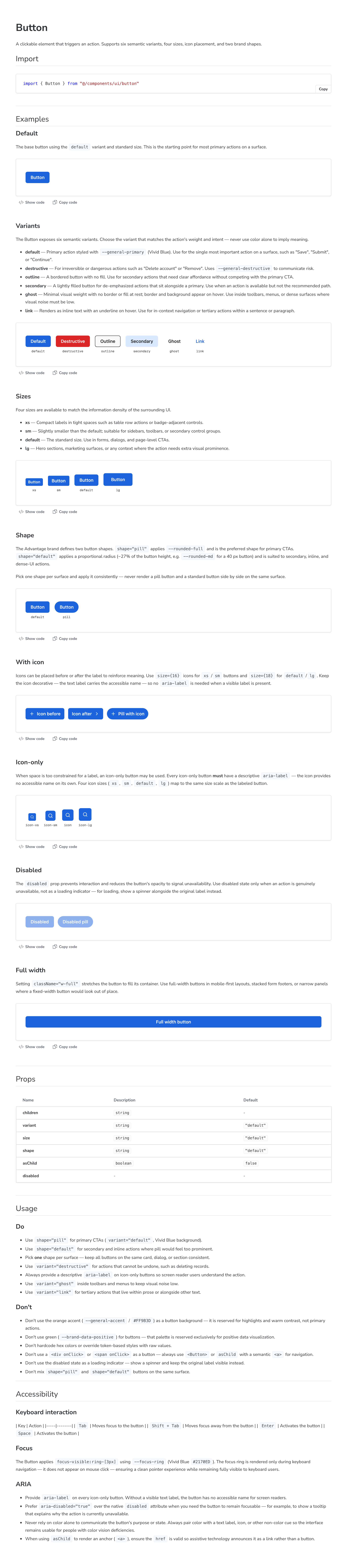
Button variants: default, destructive, outline, secondary, ghost, link
Button — six variants, each driven by semantic tokens
Button shapes: default proportional radius and pill
Two button shapes — proportional radius vs. pill — a rule, not a free choice

Layer 04 · Quality

Documentation and guardrails, generated alongside the code

Every component carries its own docs and tests. Storybook renders the usage, do's and don'ts, and props; an accessibility addon flags violations in the panel; Vitest + Playwright run the stories as browser tests; and Chromatic catches visual regressions before they merge. The system can't drift quietly — something fails loudly when it does.

Button documentation page in Storybook — usage, variants, and accessibility guidance
Generated docs — usage, props, and accessibility guidance live with the component

The AI Layer

AI built it — and the system makes AI build it right

Two things are true here. First, I built this pipeline as a product designer, with AI as my engineering partner — the token build, the registry generator, the Storybook setup, the Vercel deploy. Second, I made the system control the AI back: coding agents now write a lot of UI, and left alone they invent off-brand components. So the agent is a first-class consumer, given rules it reads, a registry it can discover, and a default that's easier than inventing.

AGENTS.md — dropped into every consuming repo
# Advantage Design System — rules for AI agents

The golden rule
Never hand-write a component that already exists in the Advantage
registry. Install it: npx shadcn@latest add @advantage/<name>

Hard rules
· Use semantic tokens only (--general-*) — never raw hex
· Primary actions = Vivid Blue pill CTAs; orange is highlight-only
· Greens are reserved for positive data viz — never decoration
· Focus rings via --focus-ring; hit targets ≥ 24px (44px mobile)
GUIDELINES.md — governance as MUST / SHOULD / NEVER
MUST   Use semantic tokens in components — never raw palette tokens
MUST   Two-layer shadows (ambient + direct) — never a single layer
MUST   Primary CTAs use the pill shape in Vivid Blue
SHOULD Use the standard shape for secondary / dense UI
NEVER  Use the orange accent as a primary action color
NEVER  Hardcode a hex value — all color traces to a CSS variable
Claude Code · advantage workspace · MCP connected
Designer

Add a primary “Request quote” call-to-action to the supplier card.

Agent

Reading AGENTS.md → the Advantage registry already has a Button. I won't hand-write one. Discovering it via the shadcn MCP server and installing:

npx shadcn@latest add @advantage/button

Per the guidelines, a primary CTA uses the pill shape in Vivid Blue — so I'm rendering <Button shape="pill">Request quote</Button>. Tokens and focus ring come from the system; nothing hardcoded.

The mechanism behind it: a Storybook MCP server exposes the live registry so an agent can list, search, and install real components instead of guessing — and project-level CLAUDE.md + GUIDELINES.md load the brand rules into the agent's context automatically. The on-brand path becomes the shortest path.

Key Decisions

Four calls that shaped the system

01

Figma as the single source of truth

Tokens are authored once, in Token Studio, and flow outward. Code never owns a value.

02

Semantic over raw, always

Components speak intent (--general-primary), never palette. Re-brand without touching a component.

03

A registry, not a package

Consumers own the source and the tokens travel with it — adoption without lock-in or version wars.

04

Constrain the agent, don't trust it

Rules-as-code plus MCP discovery make the on-brand choice the default — for people and AI alike.

What it enables

From scattered libraries to one operating model

  • A token edited in Figma reaches production through one automated path — no manual copy.
  • A new project installs themed, accessible components with a single command.
  • AI agents build on-system by default instead of inventing off-brand UI.
  • Visual-regression and a11y checks catch drift before it ships.
  • Three sibling brands run on the same model without sharing a codebase.

Reflection

I'm a product designer, not a platform engineer. With AI as a build partner, I shipped the whole pipeline myself — tokens, build, registry, docs, deploy. The design was making the right thing the easy thing. The AI was how one person got it built.